
In collaboration with fellow graphic designer Molly Gaffey, I designed a new dining app for University of Michigan students. We were both in the same dorm our freshman years and remembered how poor the dinning hall experience was. After observing students in the dining hall and interviewing them and dining hall staff, we identified our user persona and created a journey map along with sketches of potential features.


This journey map helped Molly and I identify areas of pain for U of M students throughout their day, especially at the dining halls. Our journey map was informed by research we conducted through interviews with fellow students and dining hall staff, as well as observing students as they went through different dining halls on North and Central Campus.


Since the app we were creating was associated with the University of Michigan, we followed the branding guidelines set by the University.
Molly and I shared these preliminary wireframes with our fellow classmates to gauge the effectiveness of our designs and to see whether users knew how to use our features or not. Getting multiple people to look at our project taught us how to design the app with the user’s capabilities and perspective in mind, rather than design it how we as the designers would use it.
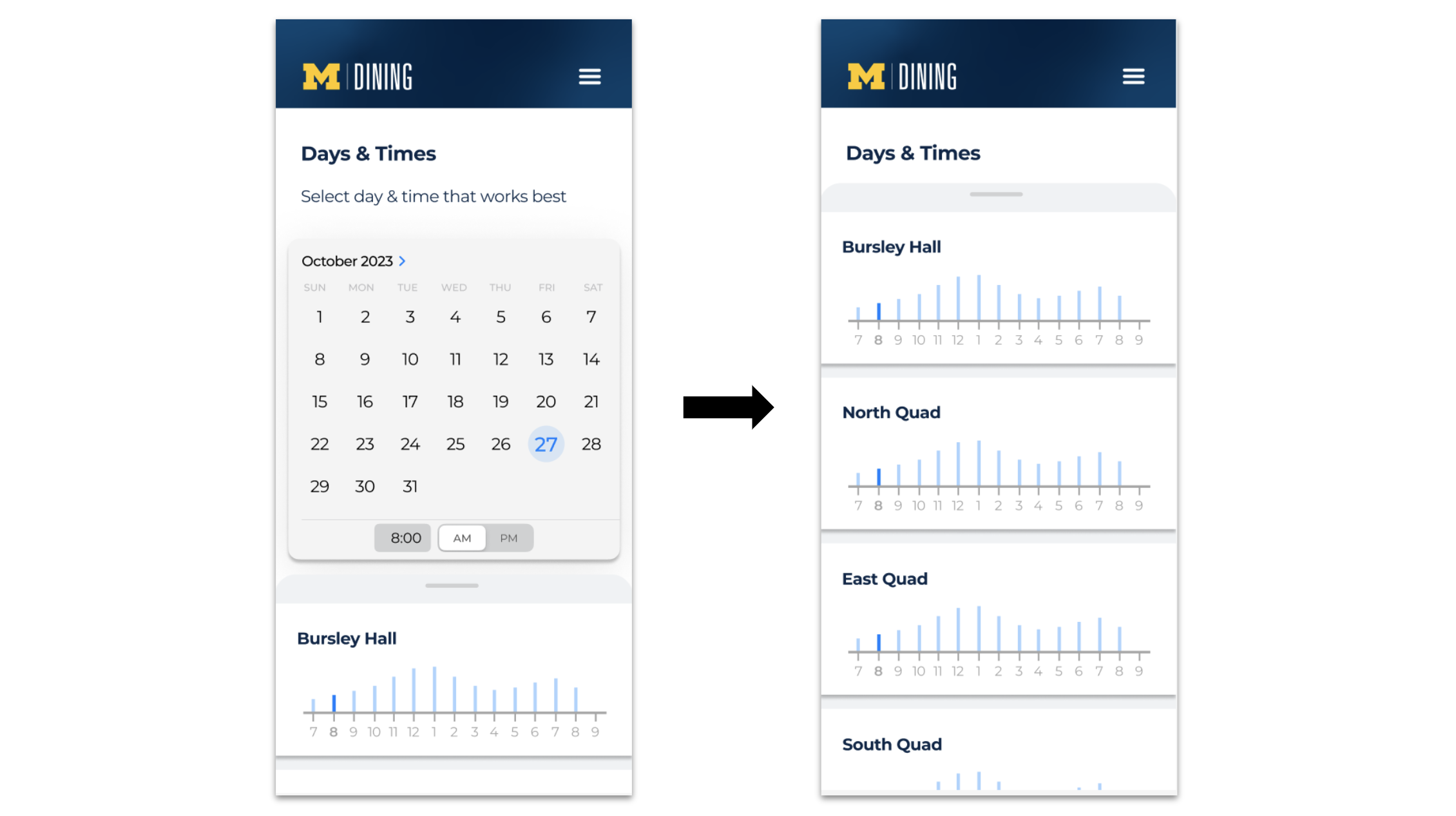


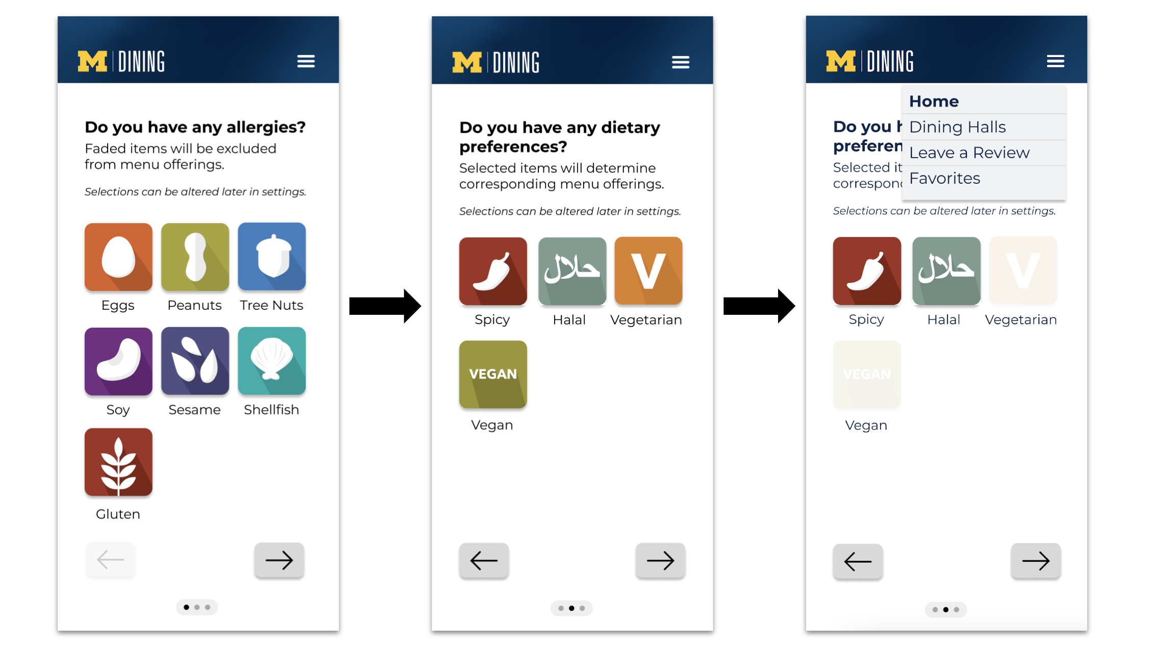
Our app, tailored for University of Michigan students, centralized dining hall information. Users could select specific dining halls and access details including location, hours, special events, and menus for breakfast, lunch, and dinner. A calendar displayed holiday openings and themed meals. Busy times were indicated on a timeline. Students could rate meals and offer reviews, crucial for those with dietary restrictions. The app categorized food descriptions (vegan, vegetarian, Kosher, Halal, gluten-free) for easy selection. Our goal was to streamline scattered resources into a user-friendly, comprehensive platform for a seamless dining hall experience.