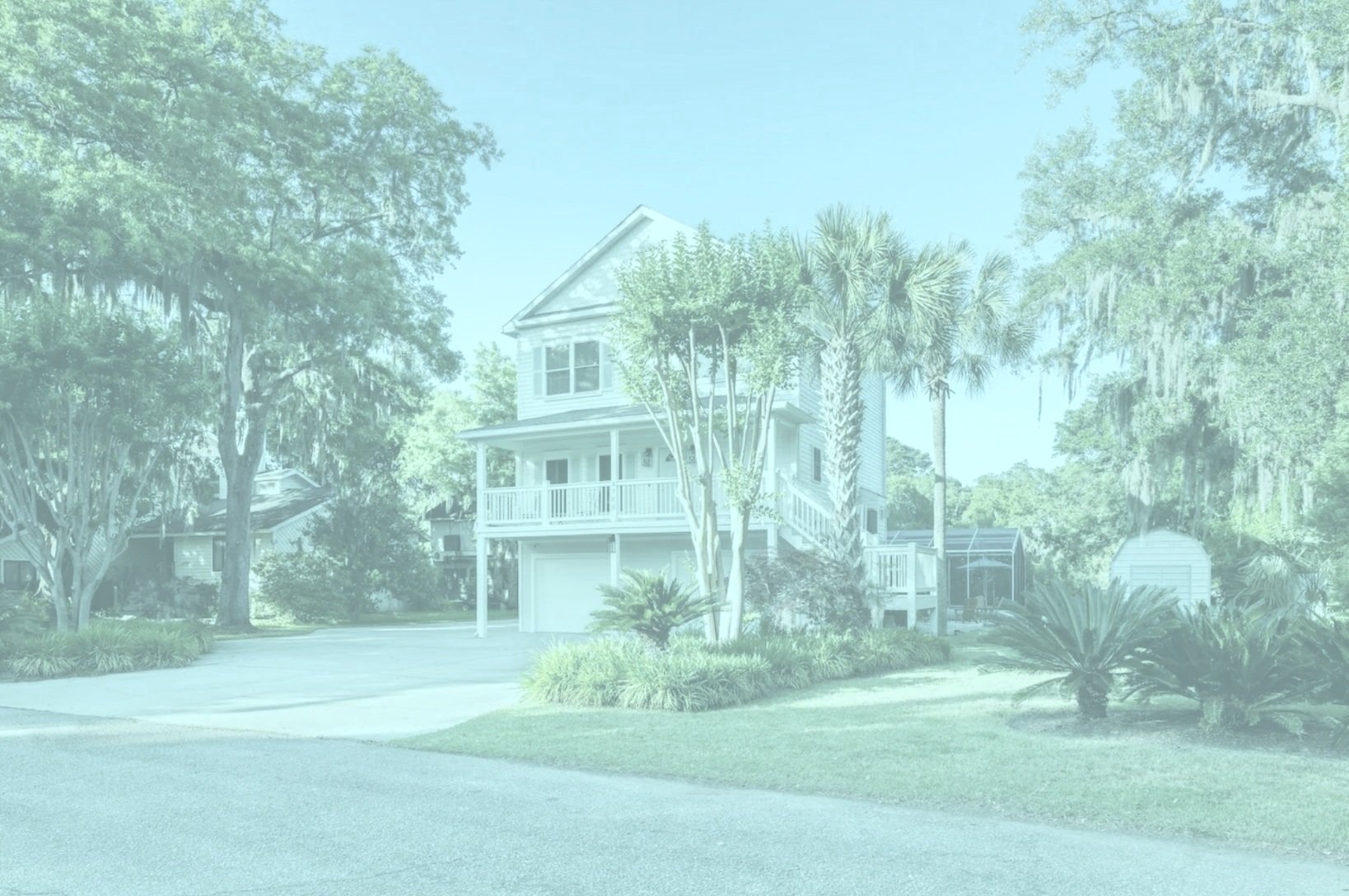
A family friend commissioned me to design a logo for her AirBNB in Charleston, North Carolina. She emphasized the property's proximity to the beach was a key feature she wanted to highlight, so I incorporated elements that reflect this aspect. Additionally, considering her enjoyment of beach sunsets, I included a representation of the sunset in the design. The logo will be utilized on various items, including coasters, koozies for guests, and signage throughout the property.
These were the three final directions that I delivered to the client. The third iteration was the one that we ultimately chose.
Above are the three logo designs I developed for Crushing on Charleston. The initial two designs were characterized by symmetrical and straightforward elements, which, while clean, lacked a welcoming quality. For the third design, I aimed to achieve a more hand-drawn and artistic feel to better convey warmth and approachability.
When I started this project, the client had a strong vision of the visual identity for her AirBNB. She wanted a logo that incorporated the water, a palm tree, and the setting sun. This logo was to incorporate her favorite part of the AirBNB, getting to watch the sunset next to the water.
For the color palette, I took inspiration from this surf board hanging on the wall in one of the pictures of the AirBNB. I decided to use the pink for the sun, the green for the palm tree, and the teal for the waves. I also came up with two other color palettes like the client and I agreed upon.
I chose the script typeface SantElica Script to add a sophistication to the logo and convey that this was a high quality AirBNB.
We agreed upon a fee for my services, which includes delivering three distinct logo designs with various color combinations for her selection.
I started the design process by searching for Hotel and AirBNB branding on Pinterest. I also sketched different designs and sent them to the client. She wanted a circular logo, so that is what I focused on.


